In Streaming Upgrades, Part One, I covered technology upgrades I’ve made to our streaming setup. With the tech squared away, I started thinking about the channel itself. My cobbled together backgrounds and such were charmingly(?) amateurish at best; pure cringe at worst. Don’t get me wrong; I’m still very much an amateur, but it was time for a redesign from the ground up so I could begin to unify the channel’s look. It was time to upgrade my streaming graphics.
Currently, my streaming setup has five scene collections; three for my main streaming location on my big desktop, and then two for using on Heather’s laptop if the desktop is unavailable for some reason. The desktop’s collections were built to stream Elite: Dangerous, Borderlands, and Retro Games. The laptop has basic setups for Elite: Dangerous and Beat Saber, both of which are so out of date that they won’t even work any more. That’s a battle for another day, however.
Elite: Dangerous takes up the overwhelming majority of our streaming time, so I decided to start with that. It had the most complicated setup. The main gaming scene had become a bit cluttered. Other scenes focused on a closeup of me if I was just talking, as well as a few gimmick scenes for notable events, or break time.
My goal was to make:
- A new “Stream Offline” graphic (animated or not)
- A new “Live Soon” screen (animated)
- A new primary streaming screen with the game and info
- A new closeup screen (just a different background really; not shown in this post)
- A new “Break Time” screen (animated)
Despite having no idea of how to actually make any of that happen, I dove into Photoshop and started trying to figure out the process. I have zero painting/coloring/artistic skill, but I can make things line up and the tedium of layering frames of text to animate them appealed to me. I spent a couple of long sessions trying and failing to make anything I liked, and then it all clicked. In two glorious hours, I realized how to create the animations I was after. The image in my head suddenly appeared on the screen as a looping MP4 and an animated GIF. We used them for the first time last night and they were met with great success by all three viewers! Now comes the part where I brag and show off my newly created streaming graphics.
(As you continue, consider I’m just an IT Sysadmin, not an artist.)
First Up: “Stream Offline” Streaming Graphics
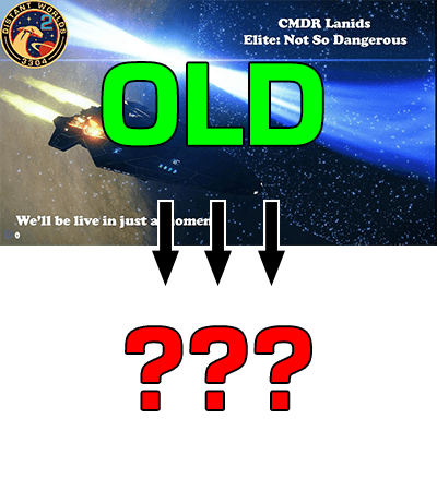
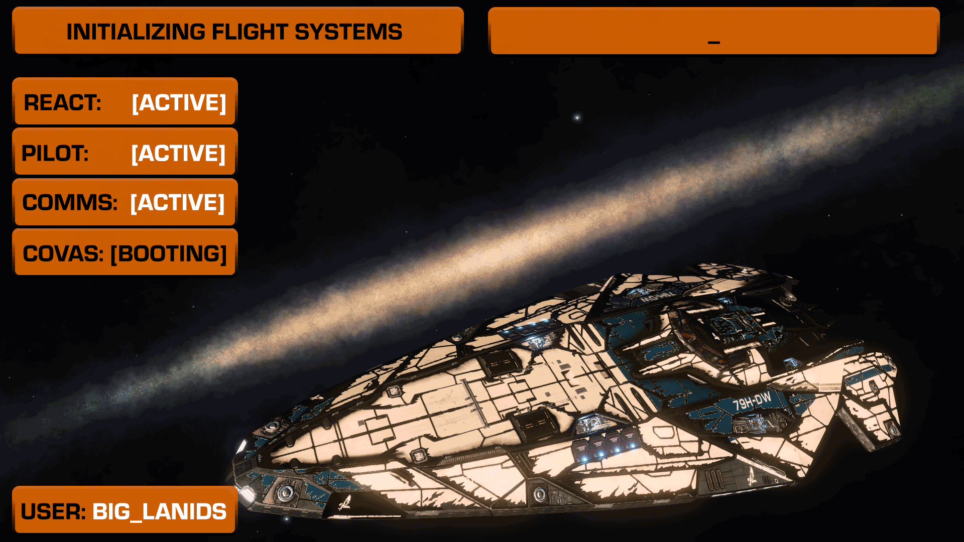
To create the first graphic I made for the stream being offline, I took a screenshot I liked (from the first waypoint of the Distant Worlds 2 expedition) and added some text to it. Done. It was better than nothing, and said what I wanted to convey: “This stream is not live.”
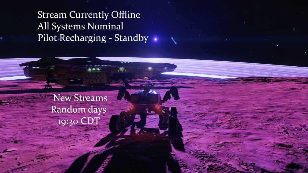
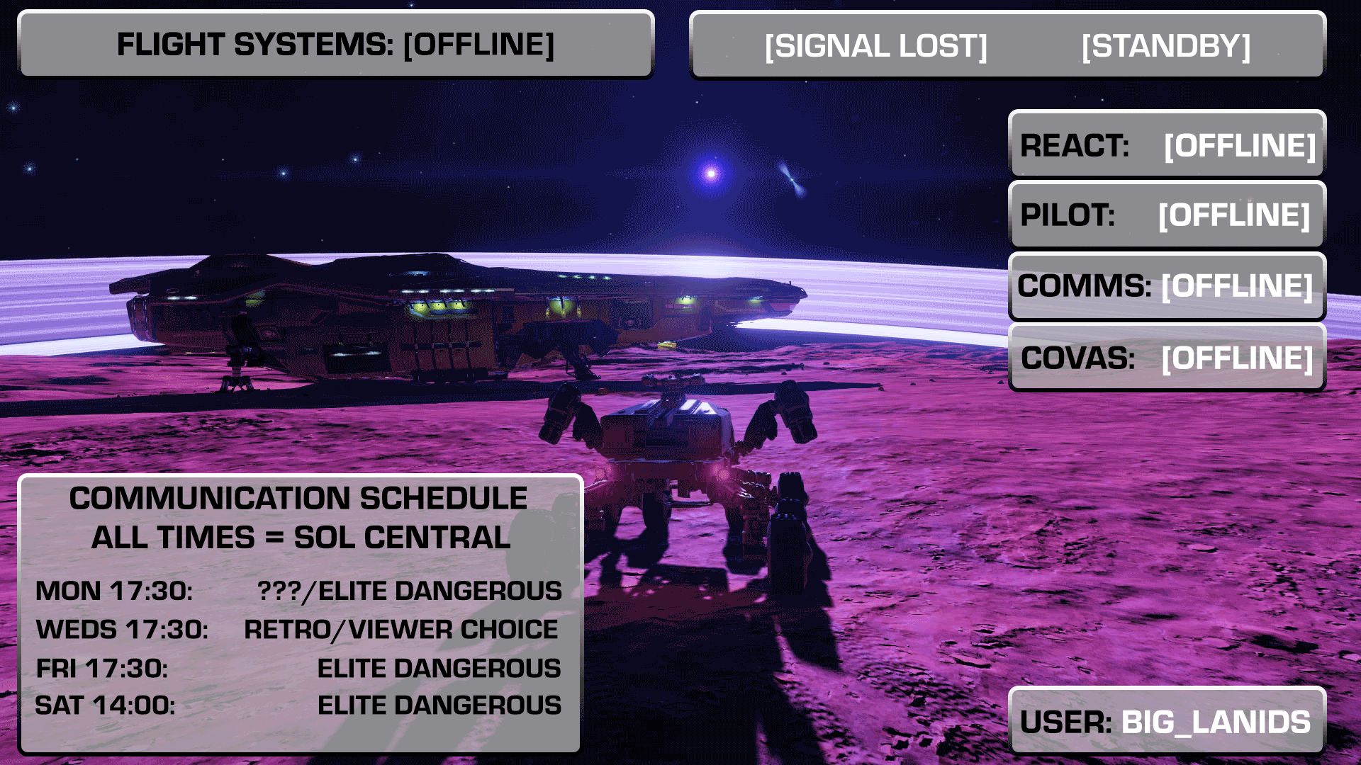
For the new “offline” streaming graphic, I wanted to run with the idea of a cockpit console or overlay showing the ship’s status. I couldn’t make a decent looking representation of an Elite Dangerous cockpit, so I took the colors (orange with black or white text) and font (Eurostile Bold/Heavy) and decided to make a set of animated buttons showing the various systems status. The whole setup would cycle, as though the ship’s computer were in a lower power mode, checking systems, waiting for them to wake up. The final element would be a static communications schedule, showing expected times for streaming.
To compensate for my lack of skill with coloring and layering, I decided to make everything somewhat blocky and pixelated. As a style, it’s a lot easier to work with and more forgiving in general. Also, I grew up in the golden age of home video games (Atari/8 bit/16 bit) and I love the look. For streaming graphics it should work well.
The famous design of consoles from Star Trek (LCARS) clearly influenced me.
After a bit, I had “buttons” that worked for me, and I was able to get all of the layers lined up so that the cycling looked natural. I fiddled with timing until I found a rate that felt good. At the last minute, I changed the buttons from Elite’s usual orange to grey, to further reflect the ship’s non-active state and further accentuate that this was not a live channel.
The new graphic was finished; I exported it as a static .JPG to use on Twitch itself, as well as a looping movie for use in OBS when streaming (for the brief startup and shutdown at each end of a broadcast.)
Next Up: “Live Soon!” Streaming Graphics
Next up, I tackled my “Live Soon” graphic. I always wait a couple of minutes after going live to begin the stream proper, because it takes Twitch some time to send notifications and for folks to trickle in. This graphic displays during that period of 1-5 minutes after I initiate a broadcast.
My original base graphic was, once again, a screenshot with some text thrown on it. Add in a chat box and some music and you have a basic “hurry up and wait” streaming screen.
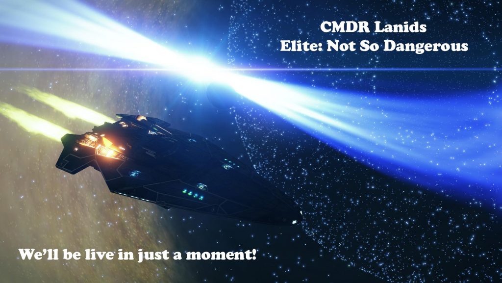
I wanted the new design to be very similar to the offline graphic, except the ship would now be “powering up.” I also wanted to change the background. The image I used with the neutron star plus black hole was striking, but didn’t have large, empty areas to put the buttons. The new background was taken at Beagle Point at the end of Distant Worlds 2. The void above the galaxy seemed a perfect spot to put the overlay.
I made the the elements orange to reflect the ship being in a powered state. Reactor, Pilot, and Communications are live and we’re just waiting for the COVAS (COckpit Voice ASsistant) to get to work. In the next iteration, I’m going to put COVAS as [ACTIVE] and have [PILOT] as [SRCH] or something similar, to reflect that the ship is ready and I’m just not there yet.
I wanted a message in the upper right to animate in, like it was being typed by the pilot as we wait, as well as having the booting system flash, along with an animated ellipsis indicating the flight system initialization is underway. I fiddled for a long time, but finally stumbled on timing for the various elements that made it jump out and feel “right” to me.
The end result perfectly matched what I had in my head. I still smile every time I see that text message type in.
Now, Something Different: Game Overlay
When I first streamed Elite, I had a webcam view of me slapped over the corner of the ship, and a Twitch chat window in the other corner. It worked, but was far from pretty. Since this is the screen that’s used for 90% or more of a stream, it was the most important one to get right. As we streamed, I added elements to it until I was relatively happy.
I play the game on an ultra wide monitor, which gives me the ability to have the game view take up the upper 3/4 of a 1920×1080 streaming canvas. I filled the lower portion in with a webcam view, a chat window, and some informational text (ship, fuel, system, etc) scraped from some 3rd party Elite tools I use.
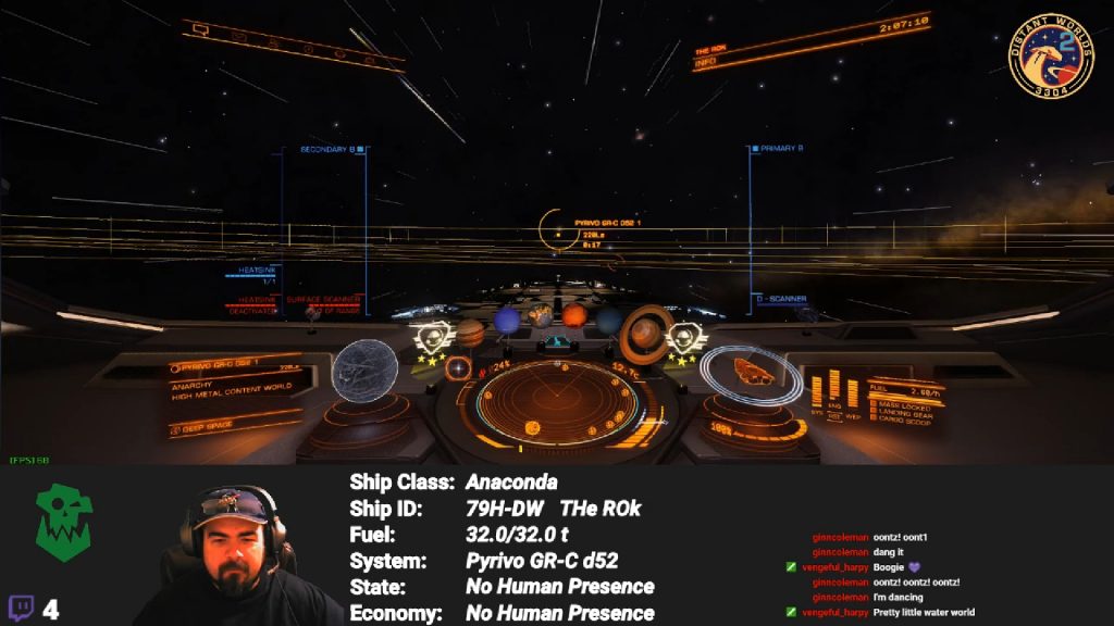
The new version was going to be largely the same. The game itself would still rule the top 3/4 of the screen. I wanted to fill out the lower space so it wasn’t all dark space, and I wanted to add in separators between the different sections. I also wanted some little buttons to indicate what the sections were. Finally, I needed to update the text font on all five hundred thousand text elements (more like sixteen or so) to be consistent with what I had made.
I popped into OBS and started writing down all the sizes of the elements, as well as their exact position on screen so that I could create a mock-up in Photoshop, which I could then use to construct the overlay. After some poking and prodding, I got everything where I wanted it to be. I figured out how to create the bar style I was envisioning (with shadows and some light reflections), added some buttons, and created new backgrounds for each section (game, pilot, ship status, and comms). Simple!
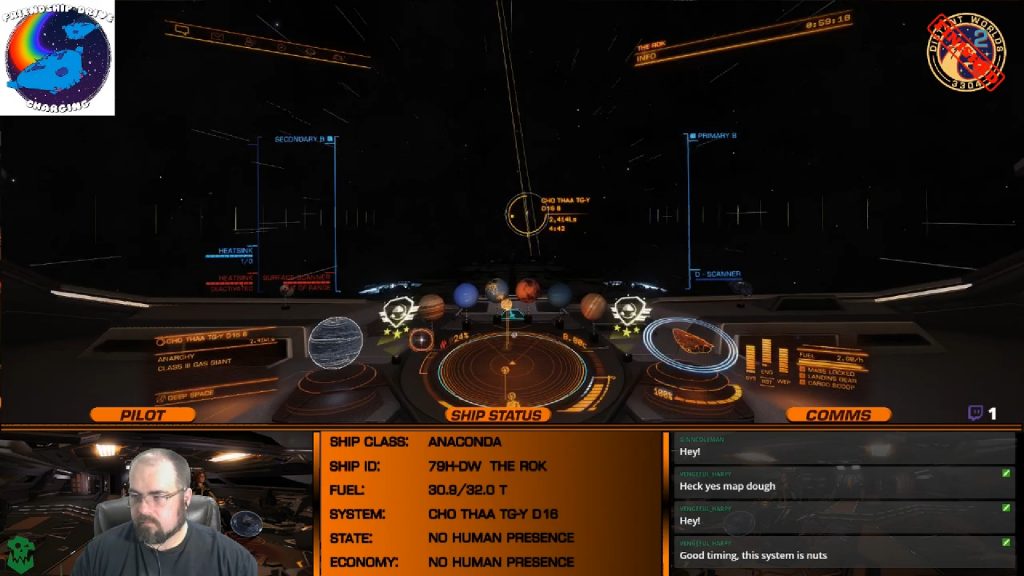
Adding a cockpit graphic behind me plus throwing in backgrounds for the other sections brought the entire section to life. When the chat is scrolling and the ship info section is updating, I think the whole picture does a reasonable job at making you feel like you’re watching a remote cockpit feed.
I was (and am) stupidly pleased with how it looks; so much so that I almost changed this week’s Retro Wednesday to “Nah We’re Playing Elite So I Can Admire My Work” Wednesday.
And Finally: Break Time Streaming Graphics
The break screen was actually the first one I did. It’s definitely going to be remade, since it uses a borrowed GIF for the warp animation, which isn’t accurate to the Elite universe. Plucking the foreground view of my Anaconda from a screenshot was a painstaking process that took way too long, because I was using the wrong tools. Live and learn!
The next version of the break screen… well, you’ll see it whenever I get around to making it. That will be version 1.0, but this will work well as a temporary measure.
Put It All Together and Go Live
With all of those changes, my Elite: Dangerous scene collection now had something close to a unified set of fonts and colors. We tested it over a couple of streams and it worked beautifully; the transitions work cleanly and the animations show beautifully at a variety of different bit rates and resolutions. The new streaming graphics had pulled everything into a cohesive package.
It doesn’t look as good as a professional set of streaming graphics, but I made them myself despite having no real idea of how to do so. In my book, that makes them priceless. Over the next couple of days, I remade the Borderlands and Retro scene collections to have their own style and feel as well. With each new change, I learn a little more and push my knowledge a little farther.
I feel comfortable saying that as far as technology and streaming graphics are concerned, I’ve built a solid enough foundation. We’re at version 1.0.
Will new streaming graphics suddenly draw in more viewers and help me unlock affiliate? Probably not, but that’s not why I made them. They represented a challenge, with a chance to learn something new.
That’s a siren’s call I just can’t resist.
You can read about the final upgrade in the conclusion, (Stream Upgrades, Part 3: Me.) (COMING SOON).